
The stock market is often described as a battlefield of numbers, but behind those numbers lies a story that charts can tell. A stock market chart is a visual representation of a stock’s price movements and trading volume over a specific period of time. Instead of going through raw data, investors and traders rely on these charts to understand trends, patterns, and market psychology.
Every stock chart is built on two basic axes: the horizontal axis (X-axis), which represents time, and the vertical axis (Y-axis), which shows the stock price. By analyzing the interaction of price and time, charts reveal whether a stock is in an uptrend, downtrend, or consolidation phase.
Whether you are a long-term investor tracking growth or a short-term trader hunting for entry and exit points, stock market charts are your guiding tool. In fact, mastering chart reading is considered one of the most important skills in technical analysis.
What Are Stock Market Charts?
A stock market chart is a graphical representation of how a stock’s price and sometimes its trading volume have moved over a period of time. These charts are an essential part of technical analysis, helping traders and investors visualize patterns, identify trends, and make data-driven decisions.
Just like any other chart, stock market charts are built on two axes:
- X-axis (Horizontal Axis): Represents time (days, weeks, months, or even minutes).
- Y-axis (Vertical Axis): Represents the price of the stock at different points in time.
By plotting price and volume data on these axes, charts give us a clearer picture of market behavior than raw numbers ever could.
For example:
- If you want to know whether Reliance Industries’ stock has been rising steadily over the last 5 years, a line chart can quickly show the long-term trend.
- If you are a day trader looking for entry and exit points in Infosys stock, a candlestick chart will help you see intraday highs, lows, and reversal patterns.
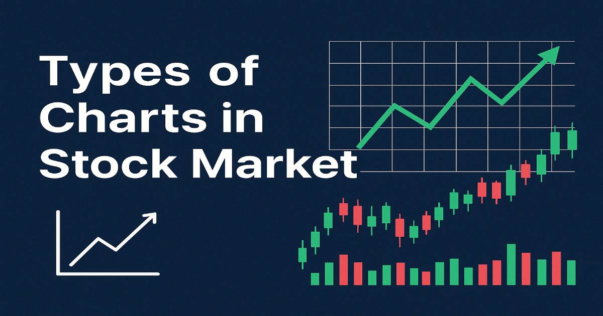
Types of Charts in Stock Market
Stock market charts come in many forms. Each chart type provides a different perspective on price movements, trading volume, and market trends. Choosing the right chart depends on whether you’re a beginner investor, a day trader, or an advanced technical analyst.
1. Line Chart
- Definition: A simple chart that connects the closing prices of a stock with a line over a time period.
- Features:
- Focuses only on closing prices.
- Easy to understand and visually clear.
- Best For: Beginners and long-term investors.
- Limitation: Does not show intraday details (open, high, low).
2. Bar Chart
- Definition: A chart made of vertical bars, where each bar shows the open, high, low, and close prices of a stock.
- Features:
- Top = Highest price
- Bottom = Lowest price
- Left tick = Opening price
- Right tick = Closing price
- Best For: Traders who want more details than line charts.
- Limitation: Looks complex for beginners.
3. Candlestick Chart
- Definition: The most popular type of chart, developed in Japan. Each candle shows open, close, high, and low.
- Features:
- Green candle = Price closed higher than it opened (bullish).
- Red candle = Price closed lower than it opened (bearish).
- Shadows/Wicks show highs and lows.
- Best For: Day traders, swing traders, and technical analysts.
- Limitation: Can feel overwhelming at first.
4. Area Chart
- Definition: A line chart with the area under the line shaded with color.
- Features:
- Highlights long-term cumulative growth.
- Very beginner-friendly.
- Best For: Investors who want a visual view of portfolio growth.
- Limitation: Less detailed compared to candlestick/bar charts.
5. Point and Figure Chart
- Definition: Focuses only on price movements, ignoring time and volume.
- Features:
- X = Rising prices
- O = Falling prices
- Best For: Advanced traders spotting support and resistance levels.
- Limitation: Difficult for beginners to understand.
6. Renko Chart
- Definition: Japanese chart that uses “bricks” instead of candles to represent fixed price movement.
- Features:
- Filters out small fluctuations.
- Shows clear market direction.
- Best For: Swing traders and trend followers.
- Limitation: Ignores time completely.
7. Heikin Ashi Chart
- Definition: A variation of candlestick chart that averages prices to smoothen volatility.
- Features:
- Displays trends more clearly.
- Helps avoid false signals.
- Best For: Swing traders and positional traders.
- Limitation: Prices shown are averaged, not exact market prices.
8. Volume Chart
- Definition: A supporting chart that shows the number of shares traded during a given period.
- Features:
- High volume = Strong buying/selling interest.
- Low volume = Weak market activity.
- Best For: All traders — used with other charts to confirm moves.
- Limitation: Cannot be used independently.
Compare Table Chart
| Chart Type | Easy for Beginners | Detail Level | Best For | Limitation |
|---|---|---|---|---|
| Line Chart | ✅ Yes | Low | Long-term investors | No detail of intraday moves |
| Bar Chart | ❌ Medium | Medium | Short-term traders | Confusing at start |
| Candlestick Chart | ❌ No (for newbies) | High | Day & Swing traders | Too much info |
| Area Chart | ✅ Yes | Low | Visual trend analysis | Less detail |
| Point & Figure | ❌ Advanced only | High | Breakout traders | Complex |
| Renko Chart | ❌ Medium | Medium | Trend followers | Ignores time |
| Heikin Ashi | ❌ Medium | High | Swing & positional traders | Averages price |
| Volume Chart | ✅ Yes | Supportive | All traders & investors | Needs price chart |
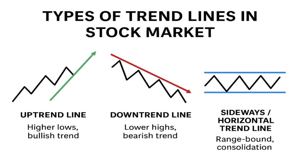
Types of Trend Lines in Stock Market
A trend line is simply a straight line drawn on a chart to connect two or more price points, showing the general direction of the market. It acts as a guide for traders to understand whether the stock is moving up, down, or sideways.
1. Uptrend Line (Bullish Trend Line)
- Definition: A line drawn by connecting a series of higher lows in a stock’s price.
- Indicates: The stock is in an uptrend (bullish phase).
- Characteristics:
- Each low is higher than the previous low.
- Shows that buyers are dominating the market.
- Example: If Infosys keeps making new highs and higher lows, drawing a line under those lows creates an uptrend line.
2. Downtrend Line (Bearish Trend Line)
- Definition: A line drawn by connecting a series of lower highs in a stock’s price.
- Indicates: The stock is in a downtrend (bearish phase).
- Characteristics:
- Each high is lower than the previous high.
- Shows that sellers are controlling the market.
- Example: If Tata Steel keeps falling and makes lower highs, the downward-sloping line drawn across those highs is a downtrend line
3. Sideways/Horizontal Trend Line (Consolidation)
- Definition: A line drawn when the stock moves sideways without forming clear higher highs or lower lows.
- Indicates: Market is in a consolidation phase (neither bullish nor bearish).
- Characteristics:
- Price fluctuates between support and resistance levels.
- Shows balance between buyers and sellers.
- Example: If HDFC Bank trades between ₹1500–₹1600 for weeks, the flat line represents a sideways trend line.
What is Uptrend Line
An uptrend line is a straight line drawn on a stock chart by connecting two or more higher lows, showing that the stock is consistently moving upward over time. It indicates a bullish trend, where buyers are stronger than sellers, and each dip in price is followed by a recovery to a higher level than before. Traders and investors use uptrend lines to identify buying opportunities, as they act like a support level — as long as the price stays above this line, the uptrend is considered strong.
What is Downtrend Line
A downtrend line is a straight line drawn on a stock chart by connecting two or more lower highs, which shows that the stock is consistently moving downward over time. It reflects a bearish trend, where sellers are stronger than buyers, and each price rally fails to reach the previous high. Traders and investors use downtrend lines to identify potential selling or shorting opportunities, as they act like a resistance level — as long as the price stays below this line, the downtrend remains strong.
What is Sideways or Horizontal Trend Line
A sideways or horizontal trend line is formed when a stock’s price moves within a fixed range, without creating clear higher highs or lower lows. This indicates a consolidation phase, where neither buyers nor sellers have full control, and the market is in balance. Prices usually fluctuate between a support level (lower line) and a resistance level (upper line). Traders often wait for a breakout or breakdown from this sideways range to confirm the next big move in the stock.
Final Thought
Stock market charts are more than just visuals — they are the language of the market. By learning how to read charts and draw trend lines, investors and traders can gain valuable insights into market psychology, spot profitable opportunities, and manage risks effectively.
- Charts like line, bar, candlestick, and Heikin Ashi help you analyze price movements with varying levels of detail.
- Trend lines — uptrend, downtrend, and sideways — guide you in identifying the market’s overall direction.
Whether you’re a beginner investor looking for long-term growth or a professional trader searching for quick entries and exits, mastering these tools is essential. Remember, charts don’t predict the future perfectly, but they provide a strong foundation for informed decision-making in the ever-changing world of the stock market.
FAQs
Why do traders love candlestick charts so much?
Because candlesticks tell a story — they show where the price opened, closed, and even the highs and lows of the day. Plus, certain candlestick shapes (like Doji or Hammer) give clues about what might happen next.
What’s the difference between an uptrend line and a downtrend line?
An uptrend line means the stock is climbing higher step by step (bullish). A downtrend line means it’s sliding lower with time (bearish).